Wednesday, 22 February 2012

Make up Session


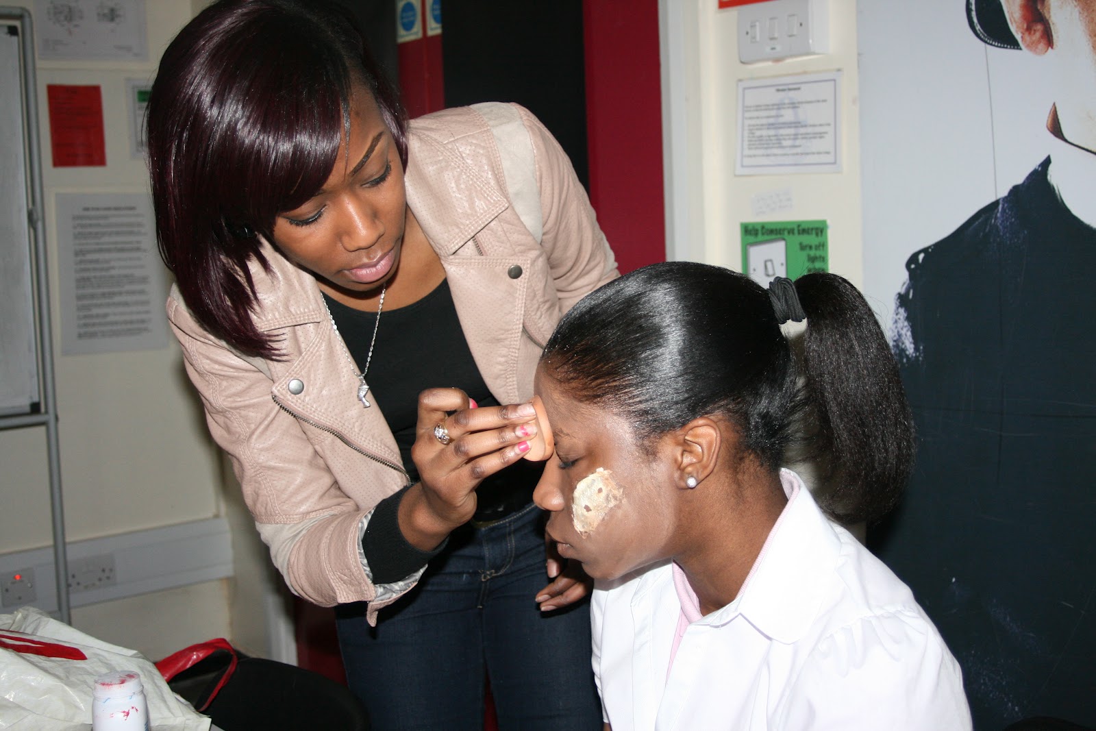
 This is our make up session and where our make up artist Gradice worked on our actor Titi, we used latex, blood and zombie skin.


Update 21/02/2012

Today we used the make up we bought from harlequins and were able to recreate our antagonist and take a photographs for our movie magazine and movie poster. We used a number of make up techniques for such as using zombie skin and latex to create a scary effect.

Friday, 10 February 2012

Textual Analysis of a Movie Poster - Martin

    
    1.     The film title: Final Destination 5

2.     Year of Release: 2011

3.     Director: Steven Quale

4.     Producer: Craig Perry, Warren Zide

5.      Production/Financing Company: New Line Cinema, Practical Pictures

6.     Actors: Nicholas D’agasto, Emma Bell, Miles Fisher, Arlen Escarpeta, David Koecher, Tony Todd, Courtney B. Vance

7.     Films Origin/info:  Franchise 5th in the series


8.     Synopsis: In Final Destination 5, Death is just as omnipresent as ever, and is unleashed after one man's premonition saves a group of coworkers from a terrifying suspension bridge collapse. But this group of unsuspecting souls was never supposed to survive, and, in a terrifying race against time, the ill-fated group frantically tries to discover a way to escape Death's sinister agenda.


The main colours used in this movie poster is a mildly dark blue, there is also different shades of blue, black and a bit of red for some text. The red is instantly eye catching as it is the only piece of red on the poster, the text states the movie is 'coming soon' which keeps the audience hooked onto the film and this also an important piece of information as this gives them a sense of mystery when the film will be released, red does represent blood and death which is connected to the horror genre. The blue used in the poster almost looks like the sky when a storm is about to occur you can also describe this as gloomy, blue however can represent the emotion of sadness and something out of the ordinary which i believe the designer of this poster is trying to achieve. Black used in the poster is minimal and it is clear that blue is the dominant colour in this poster, the black used i believe is for shadows, however black does connote fear, death and a sense of space which creates mystery.

The picture used in the poster is of a bridge which shifts into a skull, a skull instantly connotes death, mortality and terror this is a common theme in horror movies, therefore this movie poster does follow common horror conventions. The bridge is seen to break which into the shape of a skull, this may indicate that during the film there was an incident of a bridge being destroyed resulting in  a mass death. There is also the shape of two characters a male and a female on the top of the bridge, they seem to be crouching down and through NVC its as if they are trying to comfort each other and this  may also be present in the film that there is a significant relationship between these two characters which the story revolves around.

Textual analysis of a Teaser Trailer - Martin


1.     The film title: Final Destination 5

2.     Year of Release: 2011

3.     Director: Steven Quale

4.     Producer: Craig Perry, Warren Zide

5.      Production/Financing Company: New Line Cinema, Practical Pictures

6.     Actors: Nicholas D’agasto, Emma Bell, Miles Fisher, Arlen Escarpeta, David Koecher, Tony Todd, Courtney B. Vance

7.     Films Origin/info:  Franchise 5th in the series

8.     Synopsis: In Final Destination 5, Death is just as omnipresent as ever, and is unleashed after one man's premonition saves a group of coworkers from a terrifying suspension bridge collapse. But this group of unsuspecting souls was never supposed to survive, and, in a terrifying race against time, the ill-fated group frantically tries to discover a way to escape Death's sinister agenda.
The Final Destination franchise is a popular set of movies in the horror genre; the themes that this film has been centred on are fatalism, predestination and precognition in relation to death. There films are also usually centred on a group of people who die in a series of elaborate, fatal and often gory scenarios. This Textual analysis is of Final Destination 5, the most recent in the franchise and the teaser is 32 seconds in length which is within the teaser trailer limit.
The teaser opens up with the production company logo of Warner Bros. and New Line cinema combined with non-diegetic sound that sounds like a heart beat but at a really fast pace almost a thumping sound, this connotes suspense which builds up the audience for something to happen. The scene then switches to a  establishing shot of a bridge, this is then followed by a sequence of quick cuts which cuts up the scene but allows  the audience to piece together what is happening as a close up of one of the bridge’s cables is seen to snap, then cuts to the bridge having a gap in it, then a series of quick cuts showcasing a tragedy  there’s a scene  where a wide angle shot has been used where you can see the characters and the bridge falling apart,  you also see a man and woman as they are running frantically through NVC they are seen to be scared  and have some distress on their face. There is also a scene with a close up of a dark haired woman’s face with her hand reaching out for something through NVC she seems terrified. As the series of quick cuts are being used the sound quickens and falls to a stop with the last scene of the sequence is a wide angle shot which shows the scenery of the whole bridge and it falling apart.
The trailer then cuts to a blonde woman and dark haired man on the side of the bridge, through NVC I can see that they are both petrified this may indicate the fear of what was happening on the bridge and how they survived there near death experience.